...and all the King's men.
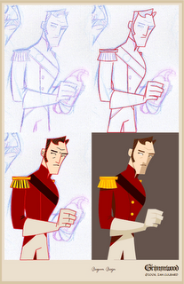
 Here is an example of the color process. I've scanned in a drawing of a Dragoon who is set to appear in Grimmwood. I imported the scanned image into Flash and got to work constructing self-trace or self-color lines (which in old money would be called a 'clean-up') using the pen tools from the toolbar. Self-trace or self-color is where the line color is the same as that of the fill. So, in effect, I use supposed shadows to highlight definition (as and when it suits) and little else. Note the shadow on the glove and the shadow of the trousers beneath; these will bleed into one another, there's nothing to set them apart. But as it will eventually be animated, movement will help define the glove being separate from the trousers. The shade of the jacket also helps with the definition.
So, I try to barely use any lines at all. I fill where fills are needed and then add brushed details (such as eyebrows, eyes and lips, and thrills on shoulder decorations etc). Fingers often require the most definition.
 I have also been working on some of the finer details of the world of Grimmwood. Notably a crest which can been seen adorning the walls of Red Hood's house. Initially I had the wolf's head pointed to the left (forward). But when out driving the other day I pulled up behind a Vauxhall at some lights and noticed that the eagle (or whatever it is) on the Vauxhall logo was seemingly looking over its shoulder. It then occurred to me that it'd make more sense to have the wolf in my crest looking over its shoulder, as though it were biting its own tail as some comment of its stupidity over its ferocity. Well, that's the general idea, so, here it is. Here you'll note also a leaf design which is quite common in many of the patterns and designs associated with Red Hood.
Grimmwood and all production work is © 2006, Ian Culbard, All rights Reserved.

No comments:
Post a Comment