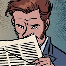
The Round Robin keeps going. Three entries in this week in quick succession so go check it out. My latest entry I decided to keep some semblance of a work-in-progress thing to show how a plate of this Round Robin looks in various states of undress. I turned this one around in about two, maybe three hours. Of the three stages, the coloring took the longest. I love getting to the coloring, it's the point in the work where you sit there trying all manner of combinations, like I'm picking out which tie goes with which shirt. It's a lot of fun (especially for a guy who doesn't wear ties). Anyway, back to the process starting at the beginning.
First up. Pencils. I call it pencils cause it's rough, obviously there's no lead involved because I'm drawing straight into a graphics tablet but it serves the same purpose as pencils so... I work really really loosely when its me that's going to be inking it. In fact, its fair to say I divide up the artworking process between the pencils and the inks. I sort of know the pencils ain't the be all and end all as nobody but me (and now you) is going to see them. And working this way drives me because it spurs me on to get to the second part of the process, the inking. Kind of like dangling a carrot. And then I'm spurred on in the inking because it's getting ever closer to the coloring. And so on.
Note how in the pencils you have the Captain's pipe sticking out of his yapper. Well, by the inking stage I've decided he's not smoking his pipe, he's holding it. I draw that straight in in inks. I ink in Manga Studio. Which I have to say is the best bit of comics software I've ever come across where inking is concerned. You can calibrate the weight of your line in Manga studio, just as you would a brush pen. And you can turn the page. It's glorious. Is as close to using a brush pen on paper as you can get.
Once I get the inking done then it's goodbye pencils and I'm moving onto colors. I export my inks out of Manga Studio as a photoshop document. Then I create a layer under the inks and fill it grayscale (my export is set to grayscale mode when I first open it up in photoshop). Okay, so in Manga Studio there's two stages, the pencils and the inks. Well, the photoshop part of the job is broken up into two stages also. Tone and color. So I start in grayscale, I put down a tone of mid gray. Under this layer there's a white fill. I then rub out parts of the mid tone and lay down darker tones until I basically end up with a tonal image. I then switch modes. Straight to RGB. I isolate areas for coloring and then using image=adjustment=photofilter I turn the gray areas into color. It's a very quick way to color. Very quick. I mix and match various combinations till I have what I want. Basically window shopping. What this effectively does is turn photoshop into your own personal shopper. Rather than trying to find something quite nebulous (ie: coming up with swatches out of the blue), it gets photoshop to show you quite quickly what it's got). And then it's just a case of mixing and matching. The trick here once you have your basic colors is to then ensure you have some consistency. So what I do is I take the whole thing roughly colored and then wash them through with the photofilter again. So all the colors then have a consistent palette to them. Like throwing in a red sock into a white wash I guess. It actually simplifies the color palette quite nicely. Then you can add stark areas of color, like yellow eyes for example, and they really stand out. If this doesn't make much sense I'll make sure I save off the stages of the color process and with my next entry I'll do an in depth spot on color.
I then apply texture. Texture can actually be quite forgiving. It like another wash through but this time it pulls the color together. In this instance I used a parchment texture and ran that through the whole thing. incredibly subtle but it makes a world of difference I make the layer a Soft Light layer so it's only very subtle and tweak the opacity. Again, picking out ties. And then using red and yellow selected in my color boxes I create another layer and filter=render=cloud and then pixelate color halftone to get that ziptone effect. I gradient it out so it fades towards the top and "Overlay" it on the empty background so it only effects the colors of the background. Overlay makes the colors quite stark in contrast. I love Overlay and Soft Light. They work best in RGB because thy really punch out the color. I then merge these into the color layer and I'm done.
Last thing I do is lettering and that's it. Done and done.