


Well, it's Thursday now and I've had three monstrously long days already. Had another trip down to London yesterday for the actual production meeting for the commercials I'm working on. Didn't get back till 10pm last night.
Slightly quieter today. Looking forward to the weekend.
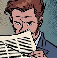
The above two images are a color exercise I did a while ago, exploring antique palettes. I'm a big fan of the pulps, which is the only reason for the subject matter.
Slightly quieter today. Looking forward to the weekend.
The above two images are a color exercise I did a while ago, exploring antique palettes. I'm a big fan of the pulps, which is the only reason for the subject matter.


7 comments:
I think I prefer the one on the left though they are both cool !!
Prefer the colours on the left too, though that might just be bacause of the Doc Savageness of them. Either way, beautiful pic, just great.
oh yeah the left one for sure. Defo. Although the right one is cool, very cool in fact.
yeah the right one's better.
It's the right one.
left.
no right.
arrgh!
I`ll settle this. It`s the left one for sure. Look`s like it`s been in the window of some exotic book shop for eons! Super!
Thanks everyone. Glad you all like. Yeah, personally, I prefer the one on the left too. And Dave, I'm glad you said it looks like its been in a shop window for ages because that's exactly what I was going for with the colors. And in contrast, the one on the right is actually based on the colors of... okay, bit of a story here, I grew up in a pre-war semi detached house, and my mother and father kept the original lining under the carpets when they carpeted the house themselves when they moved in the 1960's. Basically, the underlining beneath the carpet was magazines from the late forties and early fifties. And the color of those magazines (which made for excellent reading for me when it came to replacing the carpets in the mid eighties and laying down proper lining), is what I based the one on the right on. So, the first images is antique colors faded by the sun, the second image is the complete opposite; antique colors faded probably by damp and wear, but still retaining some of their original depth.
both are great.
the blue one reminds me of the faded
picture menus of cheeseburgers and fries you find in the best restaurants.
Hi, always liked the retro looking illustrations. I have books lust like that on my shelf at home.
Great pose too, looks like someone's in for a biffing.
Post a Comment